
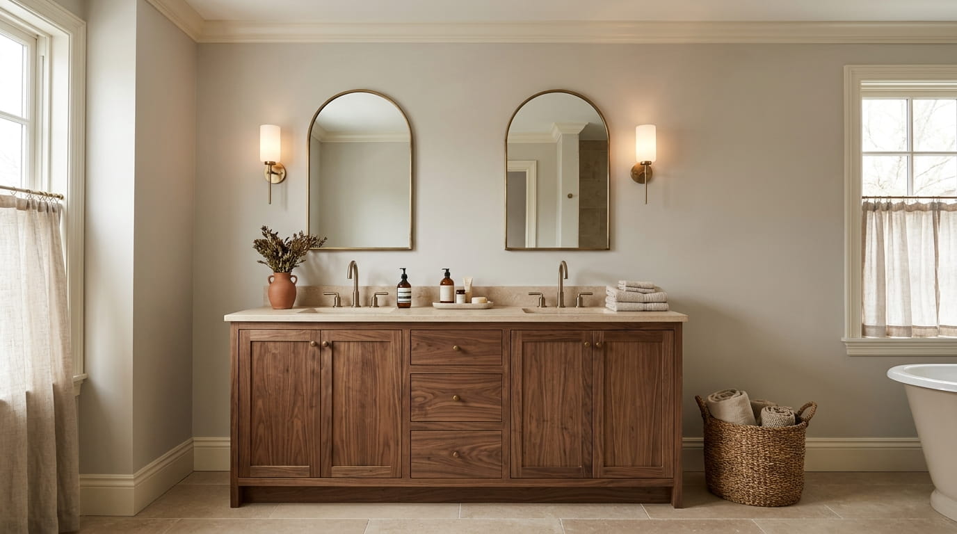
A lot of bathrooms end up stuck between two bad options. One is sterile and cold, all crisp white tile and silver fixtures that feel more like a dentist’s office than somewhere you want to linger. The other tries too hard, piling on dark paint until the room feels heavy instead of warm.
Warm neutral bathroom colors solve this without either extreme. The trick is pairing the right undertone, beige with a touch of pink, taupe with a hint of brown, with materials that carry their own warmth: oak, brass, linen, woven baskets. Get the undertone wrong and a “warm” gray can still read cold under bathroom lighting.
This list walks through 15 palettes that actually work together, not just paint chips that look nice on a swatch card. Each one pairs a base color with specific finishes and textures, so you can see exactly how it comes together, down to the hardware and grout.
Save the ones that fit your space, and skip the ones that don’t. A cozy bathroom isn’t about picking the trendiest shade. It’s about choosing colors that feel settled in a small, steamy room you use every single day.
1. Greige Walls with Warm White Trim and Brass Hardware
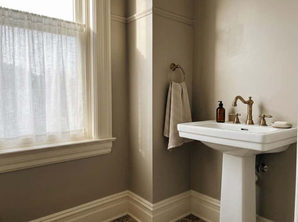
A good greige never reads as plain gray. Look closely and there’s a thread of brown or taupe running through it, which keeps the walls from going cold under bathroom lighting. Pair it with warm white trim instead of bright white, and the contrast stays soft rather than stark.
Brass hardware ties the whole thing together. Warm metal finishes pick up the undertone in the paint and keep the room from feeling flat. This combination works especially well in bathrooms with limited natural light, since the warmth does the work daylight usually would.
2. Soft Terracotta Accent Wall Against Cream Tile
Terracotta goes wrong fast when it’s used everywhere at once. Full walls of it can tip into something closer to a Southwestern restaurant than a bathroom. Keep it to one accent wall instead, and let cream tile carry the rest of the room.
The cream tile is doing more work than it looks like. It mutes the terracotta just enough that the color reads warm instead of loud, especially once the room is lit with soft white bulbs rather than daylight ones.
💡 Quick Tip
Stick to one terracotta wall, usually behind the vanity or tub, and keep the other three walls in cream so the color stays warm instead of overwhelming.
3. Warm Taupe and Oatmeal with a Walnut Vanity
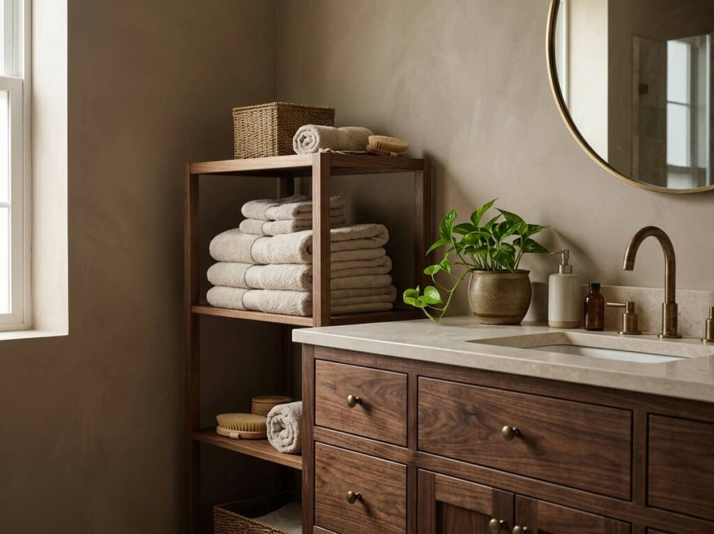
Layering taupe and oatmeal instead of picking just one gives a bathroom depth that a single flat color never quite manages. The walls stay taupe, the towels and bath mat shift to oatmeal, and the eye has somewhere to travel instead of hitting one flat wash of color.
A walnut vanity anchors the whole palette. Dark wood against the lighter walls keeps the room from feeling washed out, and it reads as a deliberate choice rather than leftover builder beige.
One flat beige on every wall, white vanity, nothing for the eye to land on.
Taupe walls, oatmeal textiles, and a walnut vanity that grounds the whole room.
4. Creamy Ivory Paired with Honey Oak and Matte Black
Matte black fixtures get blamed for making small bathrooms feel colder, but that’s only true when they’re paired with stark white and chrome. Set against creamy ivory walls and honey oak surfaces, black fixtures read as grounding instead of harsh.
The combination holds up best in bathrooms that get decent natural light, since ivory needs some daylight to avoid looking dingy. In a windowless bathroom, lean slightly warmer on the paint instead.
What to pick for this palette
5. Latte Brown Walls with Linen Textiles and Brushed Gold
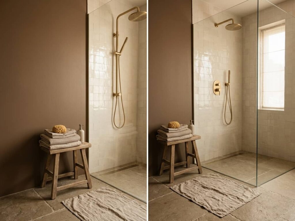
Step out of a hot shower into a latte brown bathroom and the room actually feels warmer, not just visually but in how settled it feels after the steam clears. The brown reads more like coffee with cream than anything heavy or dark.
Linen towels and a woven bath mat soften the color further, and brushed gold fixtures catch just enough light to keep the room from going flat. Done right, it feels like a small hotel bathroom that’s actually lived in, not just staged for photos.
6. Sand Beige Base with Rust Towels and Woven Baskets
Sand beige rarely needs paint at all, it already shows up in plenty of builder-grade bathrooms. The move is what you layer on top of it.
Rust colored towels pull warmth forward without repainting anything, and woven baskets add texture that flat beige walls are missing on their own. Here’s the order that works best:
Swap in two or three rust or clay colored bath towels first, they’re the cheapest change with the biggest visual impact.
Add a woven basket or two for extra towels or toilet paper, the texture breaks up the flat sand walls.
Finish with a small terracotta planter or soap dish, just enough rust tone to tie the layers together.
This one works best for renters who can’t touch the paint anyway.
7. Warm Gray with a Blush Undertone and Natural Stone
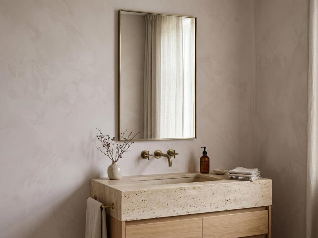
People assume gray and warm don’t belong in the same sentence, but the undertone is what decides that, not the color family. A gray with even a faint blush running through it warms up fast once it’s next to natural stone.
The stone matters more than people think. Travertine or a honed limestone counter pulls out the pink in the paint, while a cool white quartz counter would cancel it out and leave the walls looking flat gray again.
Check the paint swatch in natural light before committing, blush undertones shift under warm bulbs.
Pair with travertine, limestone, or warm-veined marble.
Cool white quartz, it flattens the blush right out.
Chrome fixtures, which read cold against this particular gray.
8. Toasted Almond Walls with White Marble and Warm Brass
Toasted almond sits in that narrow zone between beige and brown, close enough to neutral that it won’t date quickly, warm enough that it still feels cozy rather than plain. White marble keeps the pairing from tipping too dark.
The decision most people get stuck on is which white marble to use, since not all of them read the same against almond walls.
| Carrara Marble | Calacatta Marble |
|---|---|
| Gray veining, cooler cast, good for a crisper contrast against almond. | Gold-toned veining, warmer cast, blends more softly with almond walls. |
| Lower cost, widely available. | Pricier, but reads more luxe next to brass. |
Either one works, it comes down to how much contrast you want between the wall and the counter.
9. Clay Pink-Beige with Cream and Aged Brass Accents
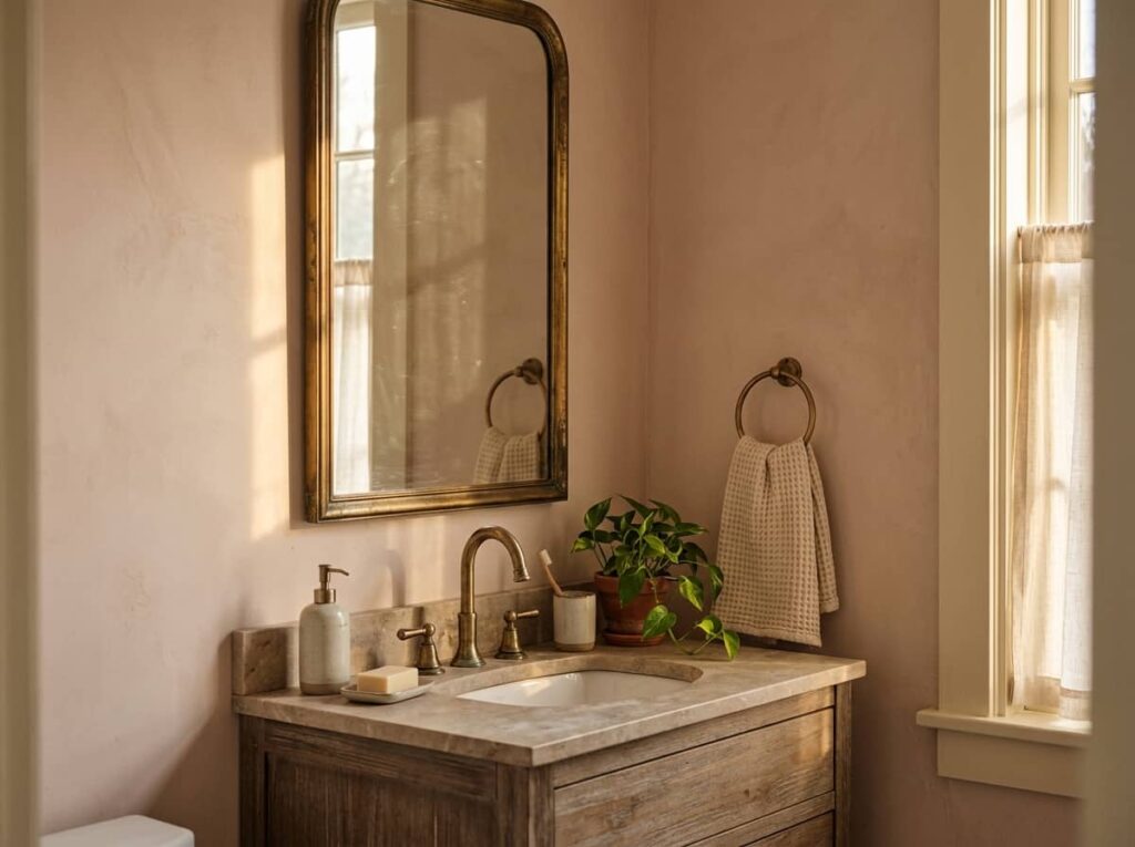
This palette earns its keep by flattering everything else in the room. Clay pink-beige is warm enough to glow under soft lighting but neutral enough that it won’t fight with existing tile or an old vanity you’re not ready to replace.
Cream trim keeps the pink from reading too sweet, and aged brass, not polished brass, gives the room a settled, slightly lived-in look instead of something that just came out of a showroom.
Aged brass, not polished, is what keeps clay pink-beige from reading too soft or too sweet.
10. Camel Tan with Cream Walls and a Dark Walnut Vanity
A friend repainted her bathroom camel tan last year and called it her favorite room in the house by the end of the month, not because it was dramatic, but because it was the one room that never felt like it needed anything else.
That’s the quiet strength of camel tan. Keep the upper walls cream, bring the tan in lower or on one wall, and let a dark walnut vanity do the heavy lifting for contrast.
📌 Good To Know
Camel tan can skew orange under cool LED bulbs. Stick with warm white bulbs, around 2700K, to keep it looking rich instead of brassy.
11. Warm Putty Walls with Ivory Tile and Copper Fixtures
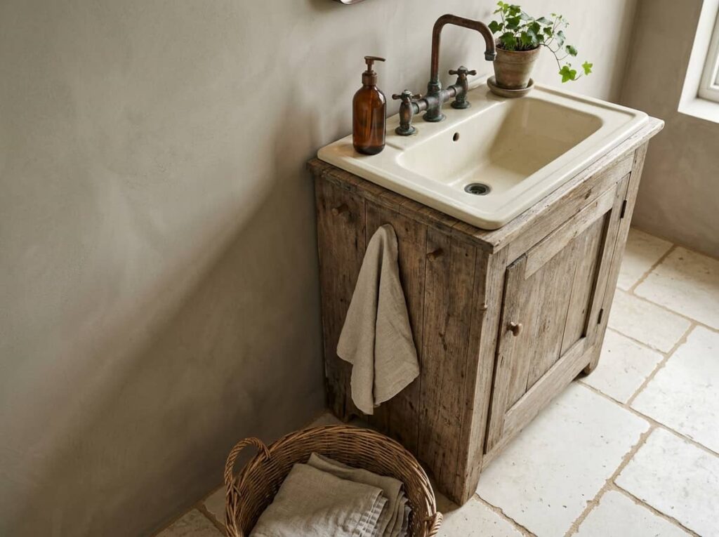
Putty sits somewhere between gray and brown, and that in-between quality is exactly why it works so well in a bathroom. It doesn’t compete with other materials, which makes it a good base for a room where you’re mixing tile, wood, and metal all in one small space.
Ivory tile keeps the floor from feeling heavy, and copper fixtures add just enough shine to stop the room from going flat. Copper patinas over time too, so the look actually improves with age instead of needing to stay pristine.
12. Soft Caramel with White Walls and Rattan Accents
Start with white walls so the room has somewhere to breathe, then bring caramel in through things you can change easily: a shower curtain, a bath mat, a stack of folded towels. This keeps the cost low and the color reversible if you get tired of it.
Where to add the caramel
Good option for a rental where repainting isn’t on the table.
13. Dusty Cream Walls with Warm Brown Grout and Bronze
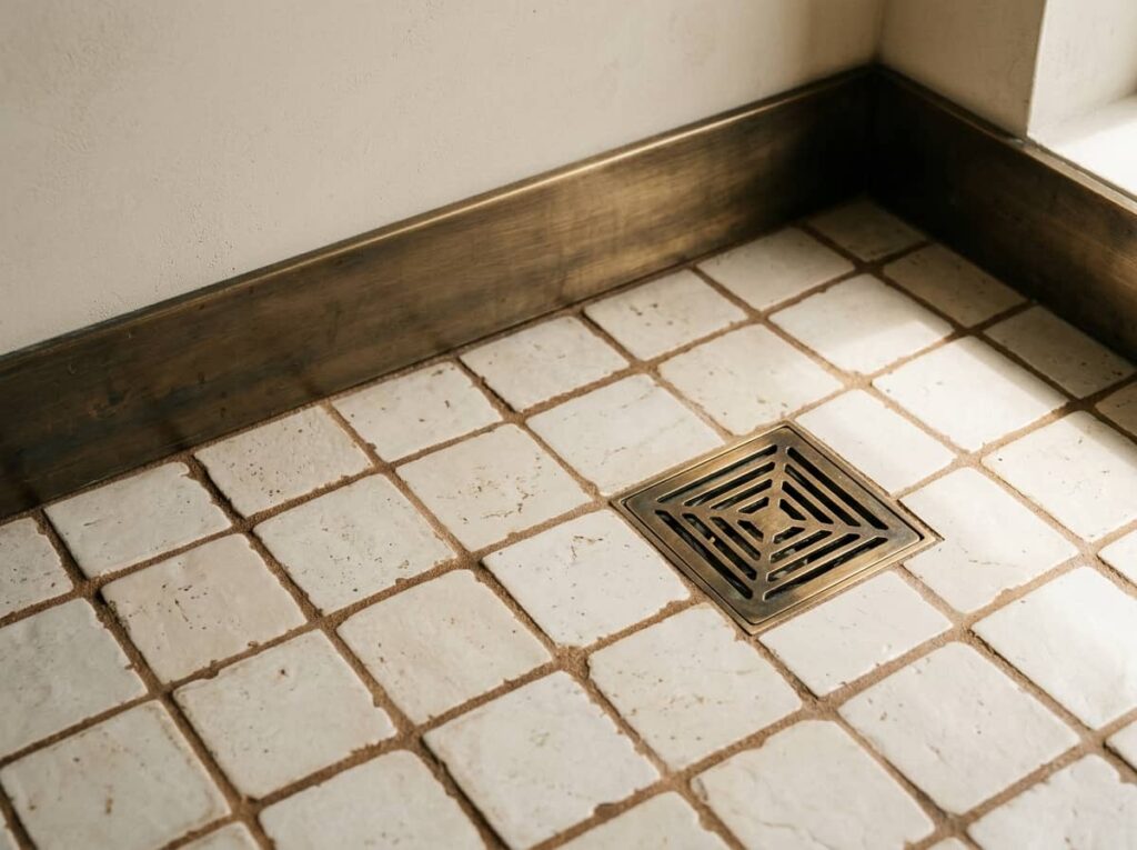
A lot of people think grout color doesn’t matter much once the tile is picked, but it changes the whole read of a room. White grout against cream tile creates a grid pattern that pulls focus. Warm brown grout almost disappears, so the tile reads as one soft surface instead of a checkerboard.
Bronze fixtures finish the look without adding shine that competes with the softness everywhere else.
Cream tile with white grout, the grid lines fight the soft wall color.
Same tile, warm brown grout, the floor reads as one soft surface.
14. Warm Stone Gray with Honey Wood and Linen Textiles
Stone gray and honey wood pull in different directions on their own, one cool, one warm, so the balance between them is what decides whether the room feels put together or just mismatched.
| More Gray | More Honey Wood |
|---|---|
| Feels calmer and more modern, good for a smaller bathroom. | Feels cozier and more traditional, good if the room gets cold light. |
| Pair with a single honey wood shelf or stool. | Pair with gray towels to keep it from feeling too matchy. |
Add linen textiles on either side of the split, the texture softens both directions equally.
15. Biscuit Beige with Soft White and Warm Black Accents
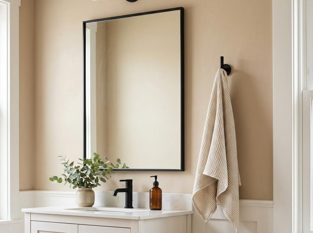
Keep the black to small, deliberate spots: a mirror frame, a towel hook, the faucet. Any more than that and the warmth of the biscuit beige starts to get swallowed up.
Conclusion
Fifteen different directions, and the common thread running through all of them is the same: warm neutral bathroom colors work because they pair a soft base tone with materials that carry their own warmth, wood, brass, linen, woven texture. None of these palettes need a full renovation either. A few swap towels and a new faucet can shift the whole feel of the room.
The best one for your space usually comes down to how much natural light you get and how much you’re willing to change at once. Start small if you’re not sure, a palette you can build on beats one you have to undo.
Leave a Reply