
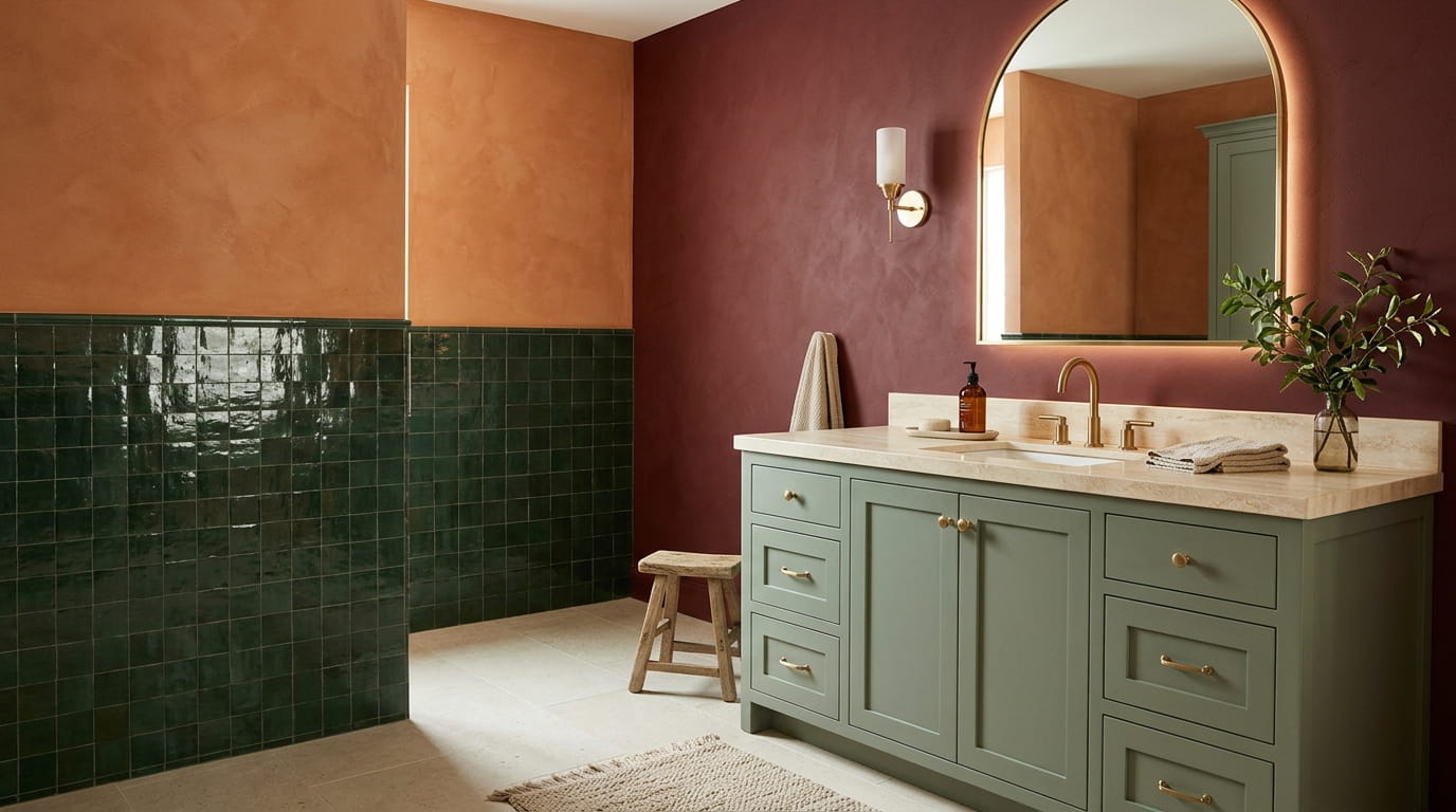
White walls feel like the safe choice until you are standing in a bathroom that looks like every other bathroom on the block. Bathroom color ideas can go so much further than another trip to the paint aisle for Alabaster or Swiss Coffee, and the fear that color will date a bathroom faster than white is mostly wrong. Color ages a room when it is picked carelessly, not because it is color.
The truth is a lot of homeowners pick white because they are afraid to commit, then end up repainting in five years anyway once the room feels flat. A sage vanity, a terracotta wall, a navy powder room, these choices read as intentional instead of unfinished.
This list leans into real color choices that work in small spaces, rental friendly spaces, and full renovations, with honest notes on where each one shines and where it gets tricky. Some are full commitments. Others are a single accent that takes fifteen minutes with a paint roller. Pick the one that matches how much risk you are actually ready for.
1. Sage Green Vanity With Brass Hardware
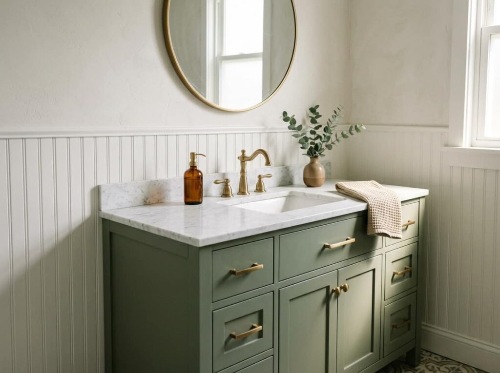
A sage green vanity reads soft and dusty instead of flat and glossy, and it never clashes with your tile the way a true green can. It sits close enough to grey that it works with warm or cool fixtures.
What makes it work:
- Keep the walls a quiet neutral so the vanity carries the color
- Choose brass or unlacquered brass pulls instead of chrome
- Pick a warm white counter, not a stark white one
2. Deep Forest Green Tile, Stopped Halfway Up the Wall
Full height tile in a dark color can make a small bathroom feel like a cave. Forest green solves that when it stops around chair rail height, with a lighter paint or a plain tile above it. You get the richness of a saturated color without losing the ceiling height, and the horizontal line it creates makes narrow bathrooms look wider instead of narrower. A grout line in white turns this from a wall into a grid.
💡 Quick Tip
Pick a grout tone close to the tile itself, like a deep moss or charcoal, so the green reads as one solid block of color instead of a grid.
3. Warm Terracotta Walls for a Sunbaked Feel
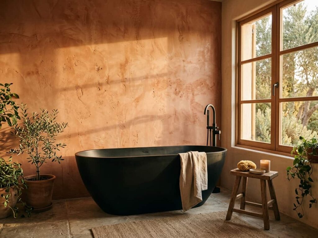
Terracotta gets dismissed as a passing trend, but it has shown up in bathrooms for centuries because it holds warmth in a room that has none of its own, no sunlight, no wood, just tile and glass. It works best on plaster look paint or a matte finish, not glossy, so it reads earthy instead of orange. Pair it with black fixtures or warm brass, and keep the floor light so the room does not feel like it is closing in.
Use a matte or plaster look finish on the walls.
Pair it with black fixtures or warm brass and a light floor.
A glossy finish, which can push the color into orange.
Using it in a windowless room with only cool overhead light.
4. Charcoal and Matte Black Fixtures, Used in Small Doses
The mistake with charcoal is going all in on walls, floor, and fixtures at once, which can read heavy instead of intentional in a small room. Charcoal works best as one strong layer, not three. Matte black fixtures against a warm white or warm grey wall give you the contrast without the cave effect, and they hide water spots better than chrome ever does.
Start with one matte black fixture, like the faucet.
Add a second black element, like the mirror frame or light fixture, once the first feels right.
Save charcoal paint or tile for the walls only if the room gets strong natural light.
5. Dusty Blue Walls With Crisp White Trim
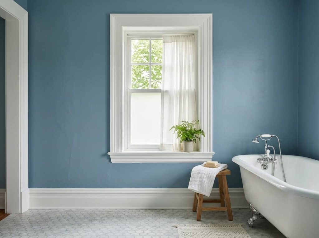
Dusty blue does something pure white cannot, it stays calm and airy but reads like an actual decision instead of a stand-in until you pick a real color. The grey undertone keeps it from turning twee or nursery like the way a brighter blue can. Crisp white trim around the window, baseboards, and door frame sharpens the whole room, almost like a frame around a painting. It works especially well with natural light, since the blue shifts gently through the day instead of sitting flat.
Plain white walls, builder grade, nothing wrong with it but nothing memorable either.
Dusty blue walls with crisp white trim, calm and intentional, with white fixtures doing double duty as a highlight instead of the whole story.
6. Warm Greige Paired With Natural Wood Tones
A lot of people pick a greige swatch under store lighting, then wonder why it looks muddy next to their vanity wood once it’s actually on the wall. The undertone is the whole story. A cool greige with blue underneath can fight oak or walnut by late afternoon light, while a warm greige makes the wood look richer instead of competing with it.
Hold the swatch against your actual wood before buying a drop of paint, never a sample board at the store.
| Warm Greige | Builder Beige |
|---|---|
| Softens next to wood tones and brass. | Can read yellow or dated next to brass. |
| Shifts gently with the light, stays calm. | Tends to look flat under any lighting. |
7. A Burgundy Accent Wall Behind the Vanity
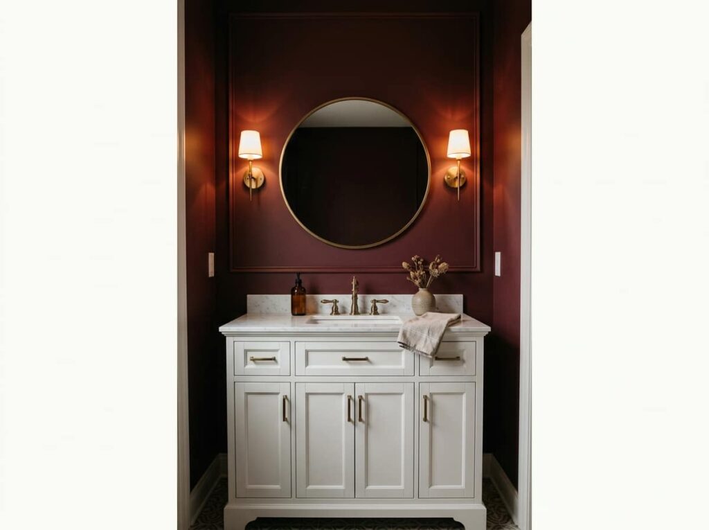
One wall of burgundy earns its place behind a vanity. Four walls of it, in a room with no windows, starts to feel like a cave instead of a design choice. Framed by a mirror and a pair of sconces, that single wall catches warmth in daylight and reads moody once the sun drops, closer to a deep wine than true red.
One burgundy wall behind the vanity gives you the drama. Four would give you a cave.
8. Butter Yellow for a Small Powder Room
A windowless powder room under a single bulb is exactly where yellow tends to go wrong, turning sickly or green instead of warm. Butter yellow is the exception, forgiving in the kind of light that ruins brighter yellows.
Before you commit a whole gallon, gather a few things first:
Before you paint, gather this
9. Navy Blue Walls With Warm Gold Accents
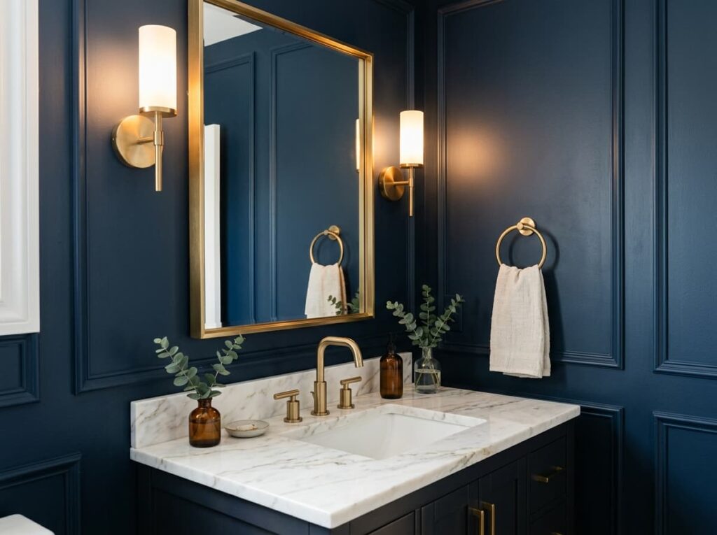
Dark glossy tile against navy walls, a brushed gold mirror frame catching the light, white marble doing the work of a highlight. Gold is what keeps navy from turning heavy, since a cool metal like chrome just disappears into the blue instead of standing out against it. It’s one of the few dark colors that photographs well, which is part of why it keeps showing up in guest powder rooms.
10. Blush Pink With Brushed Nickel Fixtures
Pink gets written off as a nursery color, but the shade that actually works in a bathroom barely reads as pink at all, closer to a warm greige with a whisper of color in it. That’s what keeps it from feeling juvenile. Brushed nickel cools it down further, which matters because warm metals like gold can push a soft pink straight into “little girl’s room” territory.
- ▸Brushed nickel fixtures, not gold, to keep it from reading sweet.
- ▸A white or pale grey counter so the pink stays the only color note.
- ▸Matte black as the one contrast piece, if you want it to feel current.
11. Olive Green Cabinetry Instead of White
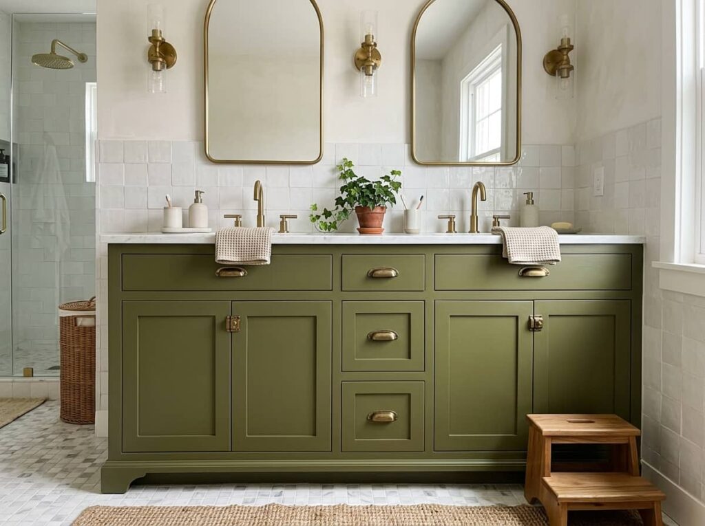
Olive green cabinetry does something stark white never manages: it hides the small scuffs and water spots that show up within a month of daily use. That alone is reason enough for a busy family bathroom. It sits warmer than a true forest green and pairs easily with both brass and matte black, which makes it one of the more forgiving dark colors on this list if you’re not sure what hardware you’ll end up with.
12. Rust Orange Tile as a Single Accent Wall
Full rust orange tile, floor to ceiling, reads very different from the same tile used on one wall behind the tub. The full room version is a serious commitment, closer to terracotta plaster walls in how heavy the color sits in the space. The single wall version is almost the opposite, an accent that reads bold in photos but lives easily with the rest of a neutral bathroom.
💡 Quick Tip
If you’re not ready to commit the whole room, tile the tub surround only and keep the other three walls plain. You still get the color, with a clear exit if you change your mind in a few years.
13. Slate Blue-Grey for a Calm, Grounded Look
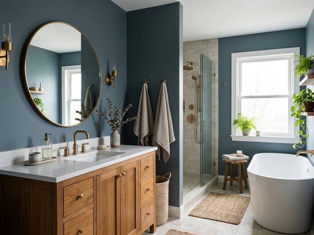
There’s a version of grey that reads cold no matter what you pair it with, and slate blue-grey isn’t it. It has just enough blue in it to feel calm instead of clinical, the kind of color that makes a bathroom feel like a place to slow down rather than rush through. It leans on everything else in the room instead of fighting for attention, which is exactly what makes it hard to get wrong.
Pair it with warm wood or brass to keep it from feeling flat.
Use it on all four walls, it can handle the full room.
Cool white light, which pushes it further toward grey.
Chrome fixtures, which flatten the color instead of warming it.
14. Mustard Yellow as a Tile Trim, Not the Whole Room
Mustard is one of those colors that works best in a thin dose, not a flood. Used as a trim tile rather than the whole wall, it reads like a deliberate design line instead of a statement you might regret in two years.
Here’s the simplest way to add it:
Pick a plain white or cream field tile for the main walls.
Run a single row of mustard trim at chair rail height or along the tub edge.
Keep hardware simple, brushed brass or white, so the trim stays the focal point.
15. Deep Plum Vanity With Warm Lighting
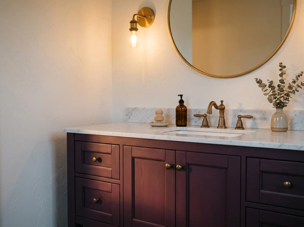
The bathroom that gets this right usually has one thing in common, a warm bulb over the mirror instead of a cold white one. Under that light, a deep plum vanity turns almost black-cherry in the evening and softens to a dusty mauve in the morning. It’s a color that depends on lighting more than any other on this list, which is exactly why it gets overlooked and exactly why it’s worth trying if your bathroom already has decent light.
A plain white vanity under a cold, flat overhead light.
A deep plum vanity under warm light, shifting from black-cherry at night to soft mauve in the morning.
Conclusion
Fifteen bathroom color ideas, and not one of them is a repaint-it-white-in-two-years mistake. The common thread is restraint, whether that’s a single accent wall, a trim tile, or warm lighting that changes how a color reads through the day. You don’t need to gut the room to try one of these. A vanity, a wall, even just the hardware finish can shift a bathroom from forgettable to intentional.
Start with whichever bathroom color idea matches how much you’re ready to commit to, not the one that photographs best on someone else’s Pinterest board. Save this list so you have the full range of options next time you’re standing in the paint aisle.
Leave a Reply