

White tile is safe. It’s also the reason so many bathrooms end up looking like a dentist’s waiting room. If you’ve been scrolling neutral bathroom after neutral bathroom and feeling nothing, that’s not a design failure on your part. It’s just not your bathroom.
Colorful bathroom tile ideas are having a real moment right now, and not the timid kind where one wall gets a “pop of color” and calls it a day. We’re talking full commitment: saturated walls, tile that argues with itself in the best way, floors that do more work than the rest of the room combined.
The hesitation makes sense. Tile is permanent, expensive to redo, and color feels like a bigger risk than paint. But a well-chosen palette and the right placement can make even a small powder room feel like a place you want to spend time in, not just pass through.
Below are twelve ways to bring real color into a bathroom through tile. Some are a single wall’s worth of commitment. Others take over the whole room, floor included. A few sit somewhere in between.
1. Terracotta Tile Walls That Warm Up an All-White Bathroom
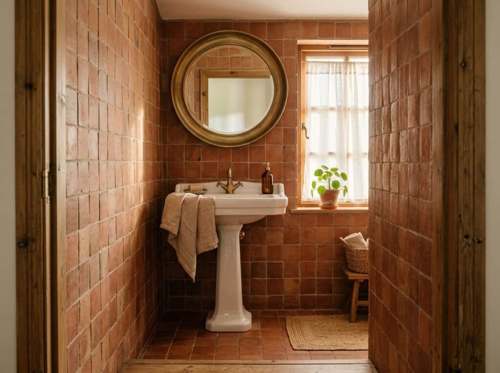
White tile is easy to like and easy to forget. Swap the walls for a warm terracotta and the room stops looking like a rental.
Terracotta reads earthy rather than trendy, which means it won’t feel dated in five years the way a lot of statement colors do. It pairs well with:
- Brushed brass or matte black fixtures
- Natural wood vanities
- White grout kept thin, so the wall doesn’t feel busy
Full wall coverage works best in small bathrooms and powder rooms, where the color wraps the space instead of competing with a lot of other finishes.
2. Cobalt Zellige Tile as a Vanity Backsplash Statement
A zellige backsplash turns brushing your teeth into a small daily event. Cobalt blue, in particular, catches light differently depending on the time of day, because the tile isn’t perfectly flat.
Keep the rest of the vanity area simple: a plain white countertop, a single sconce, minimal hardware. The tile is doing enough work on its own, and it looks more expensive when it isn’t fighting for attention.
💡 Quick Tip
Order a few loose zellige tiles before committing. Handmade batches vary in shade, and you want to see the range in your own bathroom’s light before it’s grouted in place.
3. Two-Tone Checkerboard Floors That Skip Black and White Entirely
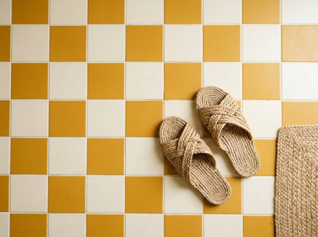
Checkerboard floors don’t have to mean black and white. Try a mustard and cream pairing, or a deep green next to a warm white, and the whole floor stops reading like a diner.
The trick is keeping the two colors close in saturation so neither one shouts over the other. A bright color next to a dull one tends to look unfinished rather than intentional.
Pick two colors of similar saturation, like sage and cream.
Test a small mockup before ordering the full floor.
Pairing a bright color with a dull neutral.
Using more than two colors in the pattern.
4. An Ombre Tile Wall That Fades From Floor to Ceiling
Ombre tile takes commitment, but it’s less risky than a single wall of solid color, because the gradient does the blending for you.
Order tile in three to five shades of the same hue, darkest at the floor, lightest near the ceiling. A few notes before you start:
- Work with a tile installer who has done gradients before. Spacing mistakes show.
- Stick to one hue family, not multiple colors
- Matte finishes blend more smoothly than glossy ones
Choose one hue and pull 4 to 5 shades, darkest to lightest.
Map the rows on paper before tile goes on the wall.
Install darkest at the floor, lightest near the ceiling.
5. Pink and Green Tile Pairings That Shouldn’t Work But Do
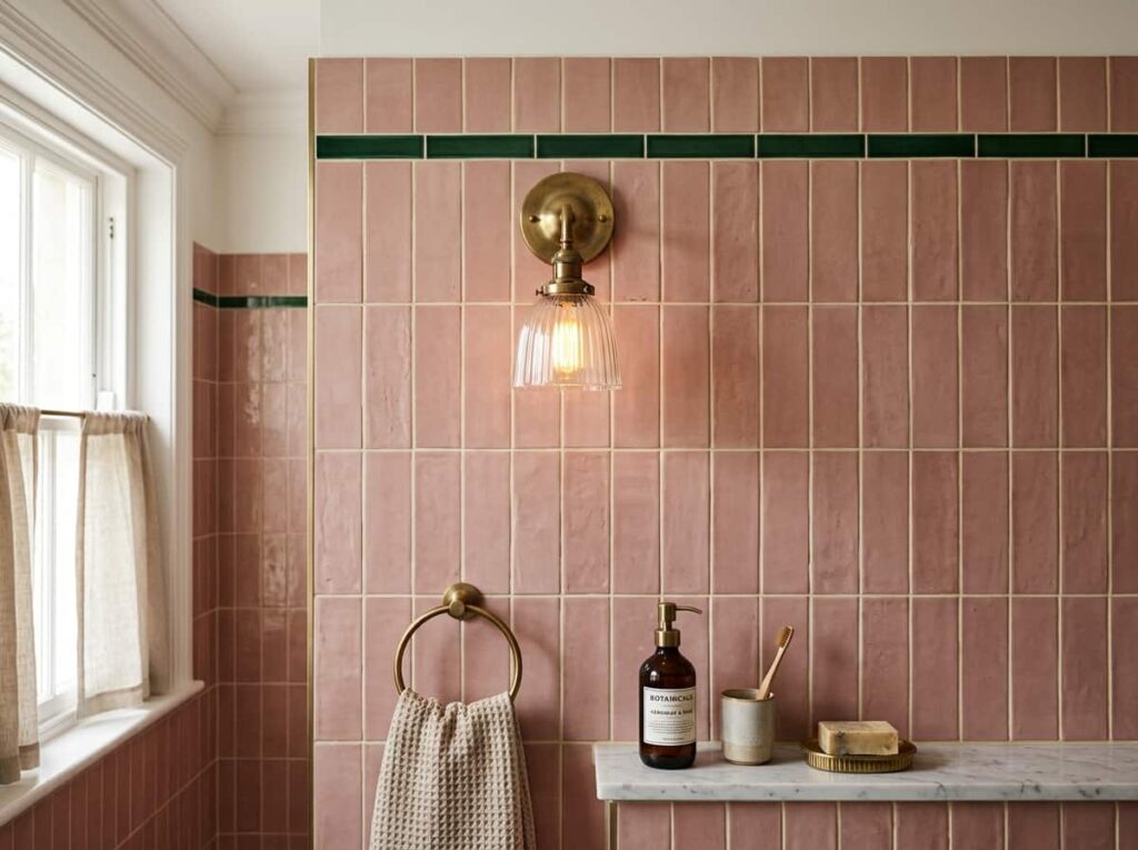
Pink and green sounds like a nursery until you pick the right shades. A dusty rose next to a deep bottle green lands closer to vintage hotel than anything childish.
Use one color as the dominant tile and the other as a border or trim strip, rather than splitting the room fifty-fifty. That ratio is what keeps the pairing from feeling loud instead of layered.
Pink and green split evenly, competing for attention across the whole wall.
Dusty rose as the main tile, bottle green kept to a slim border strip.
6. Bold Grout as the Color Move, Not the Tile Itself
Grout gets ignored right up until it’s the reason a bathroom looks unfinished.
Swapping plain white subway tile onto a colored grout line changes the whole wall without touching the tile budget. It’s one of the cheapest moves in this list, and one of the easiest to undo later if a future owner isn’t into it.
Two pairings that hold up especially well over time:
| Tile | Grout Color |
|---|---|
| White subway tile | Terracotta |
| White hex tile | Deep navy |
7. A Jewel-Toned Mosaic Niche Inside the Shower
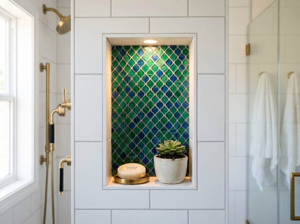
A shower niche is the smallest surface in the room, and often the boldest one you’ll ever tile.
Because it’s tucked into a wall rather than covering one, a mosaic in emerald, sapphire, or amethyst tesserae doesn’t overwhelm the space the way a full wall would. It’s a good option for anyone who loves color but isn’t ready to commit to it everywhere. Keep the surrounding shower tile plain so the niche has room to stand out.
A tiled niche is the lowest-risk way to bring in a saturated color. Keep everything around it neutral and you can go as bold as you want in that one spot.
8. Scalloped Fish-Scale Tile in a Saturated Statement Color
Fish-scale tile used to mean beachy and pastel. In a saturated color like teal or plum, the scalloped shape reads more art deco than coastal.
The shape does a lot of the visual work on its own, so one accent wall is usually enough. Overuse it and the pattern starts to feel busy instead of intentional.
Before you order
9. A Yellow Tile Floor Under Plain White Walls
Keep the walls quiet if the floor is doing the color work. A yellow tile floor under plain white walls looks confident instead of chaotic, because there’s only one thing pulling focus.
This pairing works especially well in small bathrooms with little natural light. The color adds warmth without a window to bounce it around.
10. Burgundy Tile for a Moody Powder Room Without Going Black
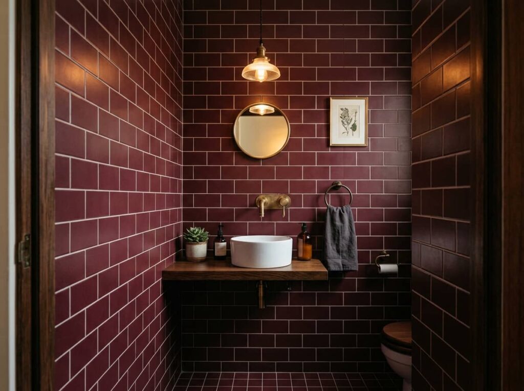
Moody doesn’t have to mean black.
Burgundy tile carries the same drama as a dark powder room without the room feeling like a cave. It reads warmer in lamp light and photographs better for anyone who plans to sell down the line. Pair it with brass hardware and a single pendant, and skip the overhead fixture entirely.
💡 Quick Tip
Test the tile under your actual bathroom lighting before ordering. Burgundy can shift toward brown or maroon depending on the bulb’s color temperature.
11. Color-Blocked Half Walls With a Contrasting Painted Trim
Tile doesn’t have to cover the whole wall to make an impact. A half wall of saturated tile, capped with a painted trim in a contrasting color, gives you the drama of a statement wall at a fraction of the material cost.
A few pairings worth trying:
- Cobalt tile with a warm white trim
- Forest green tile with a cream trim
- Burnt orange tile with a charcoal trim
Keep the trim simple, a single flat strip rather than anything ornate, so it reads as a clean line rather than competing with the tile.
Keep the trim color flat and simple, one clean line.
Stop the tile at chair-rail height, roughly 36 inches.
Using an ornate or textured trim molding.
Stopping the tile at an awkward, uneven height.
12. Patterned Cement Tile Floors That Do the Color Work for You
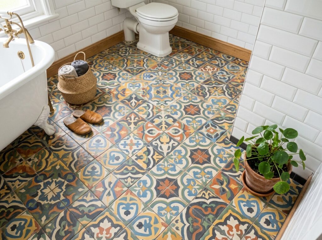
If choosing a single bold color feels like too much commitment, let a patterned cement tile floor make the decision easier. The pattern itself carries two or three colors at once, so the walls can stay completely plain and the room still feels finished.
This is the floor to pick if you want color without picking a color. The tile does the styling for you.
- Look for cement tile with a matte, slightly worn finish for a lived-in feel
- Order 10 percent extra for cuts and future repairs
- Seal the tile before grouting to prevent staining
- ▸Works in bathrooms where you don’t want to commit to a wall color.
- ▸Pairs well with plain white subway tile on the walls.
- ▸Holds up visually even as fixtures and hardware get updated over time.
Conclusion
Color in a bathroom doesn’t have to mean redoing the whole room. Sometimes it’s a niche, a grout line, or a half wall doing all the work while everything else stays quiet.
What ties these colorful bathroom tile ideas together is restraint somewhere in the room. The boldest choices here all lean on a plain surface nearby, whether that’s a white wall, a simple trim, or a matte finish that keeps things grounded. That balance is what makes a colorful bathroom feel designed instead of chaotic.
Pick one idea that matches how much commitment you’re ready for, from a niche to a full floor, and build from there.
Leave a Reply