

Most bathroom renovations stall at the same spot: the tile aisle. You want something that looks intentional, not like you grabbed whatever was on sale, but every sample starts to blur together after the tenth store visit. The truth is, a bathroom’s whole personality comes down to a handful of choices about layout, color, and grout, and most of those choices are simpler than they look once you see them laid out.
This list is built around bathroom tile ideas that hold up over time, not trends that will feel dated in two years. Some are dramatic, like a full checkerboard floor. Others are quieter, like swapping your grout color. A few just rearrange tile you might already be considering into a smarter layout.
None of these require a full gut renovation. Most work in a powder room, a kids bathroom, or a primary suite, and several can be done in a weekend if the plumbing and fixtures are already in place. Scroll through and save the ones that fit your space.
1. Black and White Checkerboard Floors That Never Go Out of Style
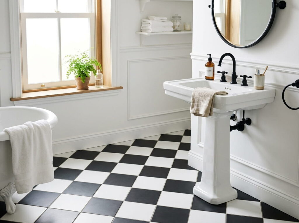
Walk into a bathroom with a black and white checkerboard floor and your eye goes straight down before it goes anywhere else. The pattern does the work decor usually has to do, so the walls and fixtures can stay simple.
It pairs well with:
- Matte black hardware
- A single pedestal sink
- White subway tile on the lower half of the wall
Keep the rest of the room quiet. One patterned floor is plenty, so save any bold wallpaper for another space.
A plain beige floor that blends into the walls and adds nothing to the room.
A black and white checkerboard floor that gives the room a built in focal point.
2. Large Format Tile Tricks a Small Bathroom Into Looking Bigger
Fewer grout lines mean fewer places for your eye to stop, and that alone can make a cramped bathroom read as bigger than it actually is.
A few sizes that work well in tight spaces:
- 12×24 inch tile laid horizontally on the floor
- 24×24 inch tile for a shower surround
- Large format tile on both floor and lower walls, so the transition blurs
Ask your installer about rectified edges too. They keep the grout lines thinner and the whole floor feels more continuous.
💡 Quick Tip
Lay large tile so the longer edge points toward the doorway. It stretches the sightline and makes a small bathroom feel longer than it is.
3. Herringbone Layouts That Add Movement to a Plain Floor
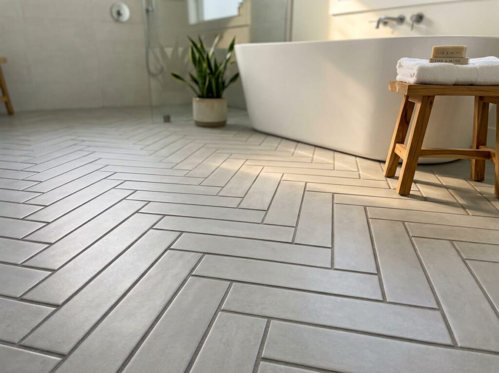
Lay the same rectangular tile you already like at an angle instead of straight across, and the floor stops looking like a floor and starts looking like a design choice.
- Pick a narrow plank tile, ideally 2×8 or 3×12 inches
- Choose a 45 degree angle for a busier look, or 90 degree for something calmer
- Have your installer start from the center of the room so the pattern stays even at the edges
It costs more in labor since the cuts take longer, but it’s one of the easiest ways to make plain porcelain look custom.
4. Subway Tile With Dark Grout for a Sharper Contrast
White subway tile with white grout almost disappears into itself. Switch to a charcoal or black grout and the same tile suddenly has structure, since every line is visible.
It’s a small change with a real personality shift. The tile itself does not have to change at all, only the grout color between it.
| White Grout | Dark Grout |
|---|---|
| Blends tile into one soft surface | Outlines each tile clearly |
| Shows dirt and mildew faster | Hides daily grime better |
| Reads soft and traditional | Reads modern and graphic |
Dark grout hides daily grime well, but seal it, since it can still pick up color from strong soaps over time.
5. Half Wall Tile Paired With a Bold Paint Color Above
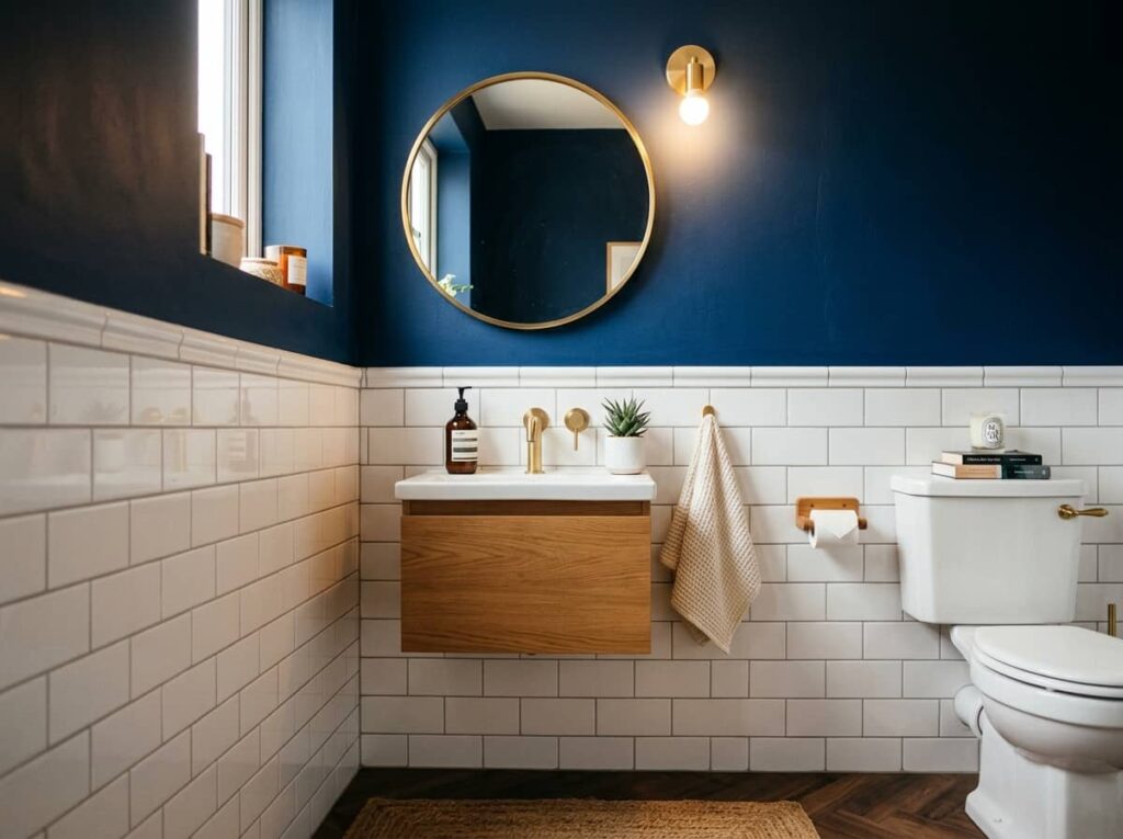
Tile does not need to run floor to ceiling to look finished. Stopping it around 42 to 48 inches and painting a strong color above the line often reads as more intentional than tiling the whole wall.
Cap the edge cleanly and pick the paint color with the same care you’d give the tile itself. This is not a place to default to safe white.
Cap the tile with a simple bullnose or metal edge trim.
Choose a paint color with real depth, not a pale off white.
Stopping the tile at an awkward height, like just above the toilet tank.
Pairing it with a paint color barely different from the tile.
6. Hex Tile Accent Walls That Frame the Shower
A wall of hex tile has a texture regular tile can’t fake, since the small repeating shape catches shadow differently than flat rectangles do.
It works best as an accent, not on every wall:
- Behind the shower niche
- As a shampoo ledge backdrop
- Framing a mirror nook
Order a bit more tile than the wall needs. Hex pieces waste more at the edges than square tile does.
Before you tile a hex wall
7. Vertical Stacked Tile That Makes Low Ceilings Feel Taller
Stack tile straight up instead of running it in a brick pattern, and the eye reads the wall as taller than it actually is.
The trick works on:
- Shower walls
- A single feature wall behind the vanity
- Half walls that stop at chair rail height
Skip busy tile here. A stacked layout looks best with something plain, since the vertical lines are the whole point.
8. One Bold Color Wall That Turns Plain Tile Into a Statement
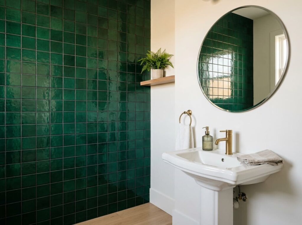
Bold color does not have to come from paint. A single wall of saturated tile, in a shade like deep green or cobalt, gives a bathroom the same punch while adding texture that paint never will.
Keep everything else neutral so the tile wall stays the focal point:
- White fixtures
- A plain frameless mirror
- Simple matte hardware
This works especially well in a powder room, where guests spend a few minutes, not twenty.
💡 Quick Tip
Bring a sample tile home and look at it under your bathroom’s actual lighting before ordering. Bold colors shift more under warm bulbs than they do under showroom lights.
9. Matte Black Fixtures Against Crisp White Tile
The faucet is usually the last thing people upgrade, and it makes more difference than most people expect. Swap a builder grade chrome fixture for matte black against a wall of crisp white tile, and the room suddenly feels more current, not just cleaner.
Start small if you’re not ready for a full renovation:
- Faucet
- Cabinet pulls
- Towel bar
Leave one warm metal accent, like a wood vanity, so the black doesn’t feel cold.
White tile paired with dated chrome or brass fixtures that read builder grade.
The same white tile paired with matte black fixtures that feel current and intentional.
10. Mixing Two Tile Sizes for a Layered, Custom Look
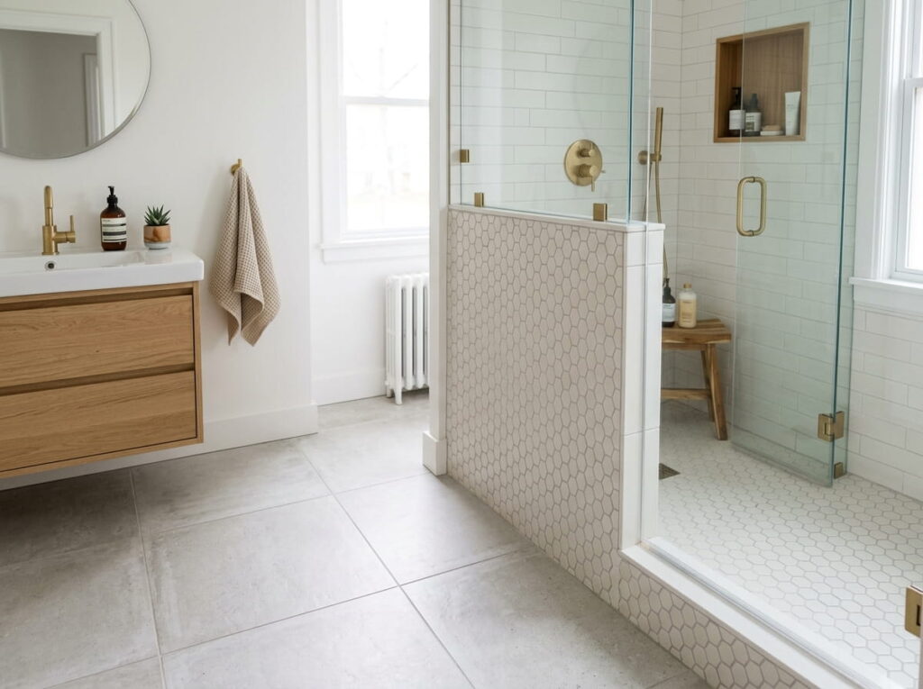
People assume mixing tile sizes will make a bathroom look cluttered, but the opposite happens when there’s a clear split, like a large tile on the floor and a smaller one on an accent wall.
A few combinations that work:
- 12×24 floor tile with 2×2 mosaic in the shower
- Large format walls with a small tile niche insert
- Big floor tile paired with hex tile on a half wall
Keep one tile plain if the other has a pattern, so the combination doesn’t compete with itself.
| Floor Tile | Wall Tile |
|---|---|
| Usually larger for fewer seams | Can go smaller since it covers less ground |
| Needs slip resistant texture | Can be glossier since there’s no foot traffic |
| Plain works best if the wall has pattern | Pattern works best if the floor is plain |
11. Textured Tile Underfoot for Safer, Grippier Showers
Smooth tile looks great in photos and turns dangerous the second it gets wet. A textured or matte finish tile on the shower floor solves that without sacrificing the style you’re going for.
Look for tile labeled with a slip resistance rating, often shown as a COF or DCOF number on the box. Small mosaic tile also works well on shower floors since the extra grout lines add grip on their own.
This matters most in homes with kids or older adults, where a slippery floor is more than a style problem.
A pretty shower floor is not worth much if it’s not safe to stand on. Check the slip rating before you check the color.
12. Marble Look Tile for Elegance Without the Marble Price
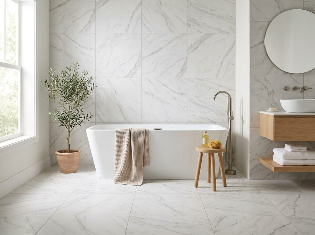
Real marble stains, etches, and costs a small fortune to seal every year. Porcelain that mimics marble has gotten good enough that most guests won’t know the difference, and it costs a fraction as much to install and maintain.
Getting the look right comes down to a few choices:
- Pick a porcelain slab with printed veining, not just a plain white base
- Choose a honed or matte finish over glossy for a more authentic look
- Match the grout color closely to the tile so the seams disappear
The one tradeoff is that porcelain won’t have the natural variation real marble has, so every slab looks slightly more uniform.
Look for porcelain slabs with printed veining, not a flat white base with no variation.
Choose a honed or matte finish, since high gloss tends to look more plastic than marble.
Match the grout color close to the tile tone so the seams blend instead of standing out.
Conclusion
A bathroom doesn’t need a full renovation to feel new. Sometimes it’s a grout color, a half wall stopped at the right height, or one tile size swapped for another that makes the whole room click. The best bathroom tile ideas usually aren’t the most expensive ones, just the ones chosen with intention instead of picked in a rush at the showroom.
Start with whichever idea matches the size of project you’re ready for, whether that’s a weekend faucet swap or a full floor retile. Save this list so you have it handy the next time you’re standing in the tile aisle trying to remember what actually looked good.
Leave a Reply