
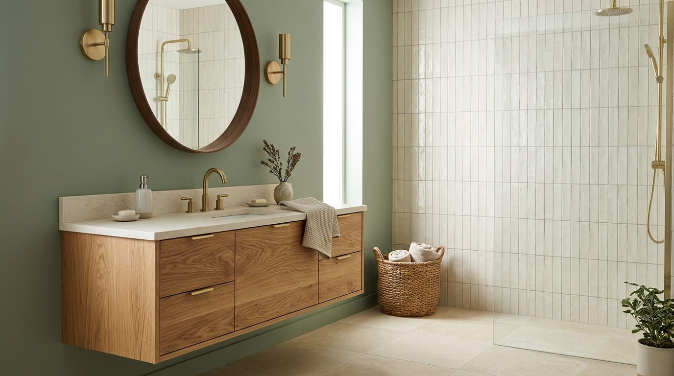
Wood accents are forgiving until they’re not. One wrong wall color and that warm oak vanity you love starts looking orange, or that walnut shelf disappears into a sea of beige. Bathroom color combinations are trickier than people expect, because unlike a living room, you’re also working with tile, grout, hardware finishes, and usually very little natural light.
The good news is that certain colors have a kind of built-in chemistry with wood tones. Sage green calms down the orange in honey oak. Charcoal grounds pale ash instead of fighting it. Deep navy makes golden wood floors look intentional instead of accidental.
This list pulls together twelve pairings that actually hold up once you’ve lived with them for a while, not just ones that look good in a single staged photo. Some lean bold, some are quiet and easy to commit to, and a few work in small powder rooms as well as full bathrooms. Pick the one that matches the wood you already have, or the wood you’re planning to bring in, and build from there.
1. Sage Green Walls With Natural Oak Vanities
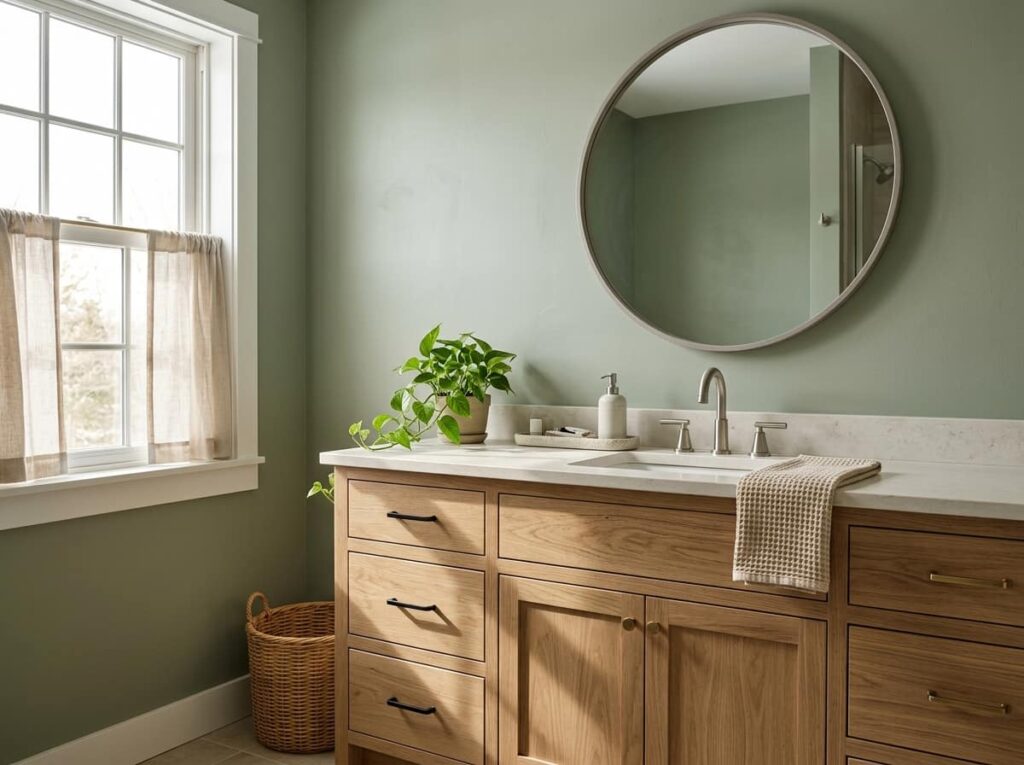
Sage green is the color that finally makes honey-toned oak look calm instead of orange.
It works because sage sits on the cooler side of green, so it balances the warmth in natural oak without clashing. A few ways to use it:
- Paint just the lower half of the wall and leave the top in white or cream
- Pick an oak vanity with a matte finish so the wood stays the quiet part of the room
- Add brushed brass or matte black hardware instead of chrome, which can feel too cold next to the green
This pairing works especially well in bathrooms with a single window, since sage holds its color in both bright and dim light without turning muddy.
2. Warm Cream Tile Paired With Walnut Cabinetry
Cream tile sounds safe until it goes yellow next to the wrong wood, and walnut is dark enough that it can turn a small bathroom muddy if you’re not careful.
The trick is picking a cream with a hint of grey in it rather than a cream with a pink or beige undertone, so it stays neutral against the cooler brown in walnut. Keep the walnut to one or two pieces, like a vanity or a mirror frame, instead of covering every surface in it.
💡 Quick Tip
Test tile samples next to your actual walnut piece in the bathroom’s real light before you commit. Cream shifts more than almost any other color under artificial light.
3. Charcoal Grey Walls Against Light Ash Wood
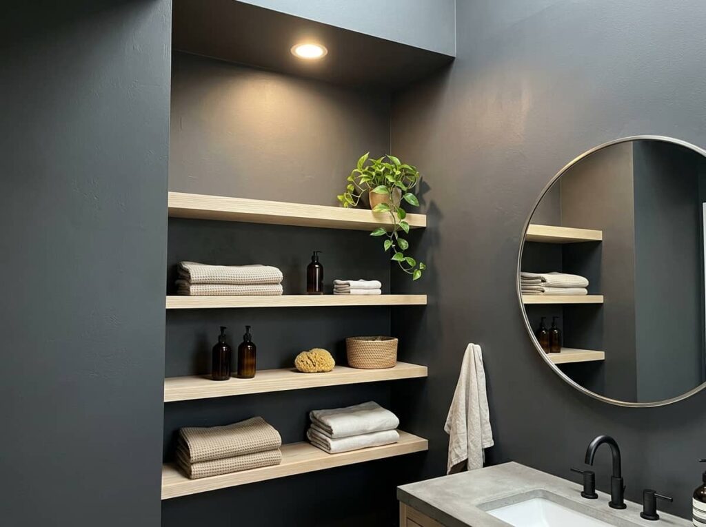
A lot of people think charcoal walls will make a bathroom feel smaller, especially with pale ash wood fixtures in the mix. That’s backwards once you see it in person.
Charcoal actually makes light ash wood pop more, because the strong contrast pulls the eye straight to the wood grain instead of the walls. The color works best in bathrooms with decent ceiling height and at least one bright light source, so it doesn’t read as a cave.
Use a matte charcoal finish so it absorbs light softly instead of looking flat.
Keep the ash wood trim or vanity unsealed or lightly oiled so the grain stays visible.
Glossy charcoal paint, which bounces light unevenly and shows every water spot.
Pairing it with dark wood too, which erases the contrast that makes this combo work.
4. Terracotta Accents Next To Teak Fixtures
Terracotta and teak both carry warmth, so the trick is layering them instead of letting them compete for attention. Start small, with a terracotta soap dish or a single painted wall, and let a teak stool or shelf do the rest of the work.
This combination tends to look best in bathrooms that already get some natural light, since both colors can feel heavy under cool LED bulbs.
Pick one terracotta surface, like a half wall or a large planter, and keep everything else neutral.
Bring in teak through a stool, shelf, or small vanity, not the whole cabinetry run.
Balance both with plain white or cream tile so the warmth doesn’t tip into orange.
5. Navy Blue Vanities With Honey Oak Floors
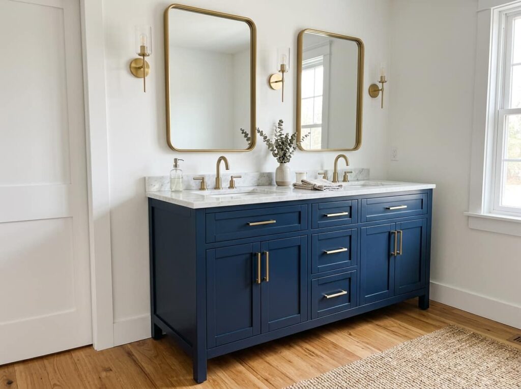
A navy vanity next to honey oak floors is one of the fastest ways to make a builder grade bathroom look custom.
The deep blue slows everything down and gives the honey tones in the floor somewhere to land instead of fighting with plain white cabinetry. It works whether the oak is original hardwood or a newer wood look tile, since the contrast does most of the heavy lifting. Keep the walls light so the navy reads as a deliberate choice and not just a dark room.
White vanity on honey oak floors reads flat and a little builder grade, with nothing to anchor the warm wood tone.
Navy vanity grounds the room, makes the honey oak floor look intentional, and gives the whole space more depth.
6. Soft Blush Pink With Dark Walnut Trim
Most people assume pink needs light, airy wood to work. Dark walnut proves that wrong.
The deep brown stops blush pink from turning saccharine, which is the biggest risk with this color in a bathroom. A walnut mirror frame, towel bar, or small shelf gives the pink something serious to sit against, so the room reads sophisticated instead of like a nursery. Stick to a dusty or muted blush rather than anything bright, since the walnut will deepen the color’s intensity.
| Muted Blush + Walnut | Bright Pink + Walnut |
|---|---|
| Feels grown up and intentional | Can feel childish or overdone |
| Works in small and large bathrooms | Better suited to powder rooms only |
| Pairs with brass or black hardware | Limited to warm metal tones |
| Muted Blush + Walnut | Bright Pink + Walnut |
|---|---|
| Feels grown up and intentional | Can feel childish or overdone |
| Works in small and large bathrooms | Better suited to powder rooms only |
| Pairs with brass or black hardware | Limited to warm metal tones |
7. Deep Forest Green Tile With Reclaimed Wood Shelving
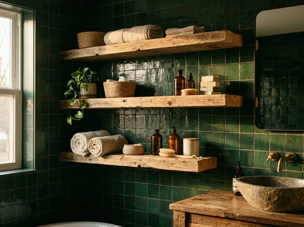
Dark green tile and rough, reclaimed wood shelving together look like something out of a cabin, in the best way.
The tile’s depth lets the texture in the reclaimed wood actually show, nicks, grain, old nail holes and all, instead of getting lost against a plain white wall. This pairing leans a little rustic, so it fits best in bathrooms that already have some age or character to them rather than a brand new build.
Reclaimed wood needs a dark, saturated backdrop to show its texture. Pale walls flatten it out.
8. Greige Walls Over Natural Pine Accents
Pine has a reputation for looking cheap, usually because it gets paired with walls that are too warm or too stark white.
Greige solves that. It’s neutral enough to not compete with pine’s natural yellow undertone, but it has just enough grey in it to keep the wood from looking like a 1990s cabin. Before you commit:
- Get a physical paint swatch, not just a color chip, and tape it near the pine in daylight
- Check the greige against your existing tile or flooring, since some greiges lean green and clash with cool floors
- Seal or lightly whitewash the pine if it reads too orange next to the wall color
Before you paint
9. Classic Black And White With Warm Teak Details

Black and white bathrooms can feel cold fast, especially with chrome fixtures and stark tile. Teak fixes that without messing with the palette at all.
A single teak bath mat, stool, or shelf adds warmth that pulls the whole room back from feeling like a clinic. Because the base palette is so simple, the teak barely has to fight for attention, it just softens everything around it.
10. Dusty Blue Walls With Driftwood Grey Wood
There’s a particular kind of bathroom, the one with a small window and middling light, where dusty blue and driftwood grey just make sense together. Neither color is trying hard. Neither one shows water spots or soap residue the way bright white does.
This combination works because the two tones are close in value, so the room feels calm instead of visually busy.
- Keep hardware in brushed nickel or matte silver, not warm gold
- Avoid pairing with glossy tile, which breaks the soft, matte effect
- Add one textured towel for contrast, since everything else here is fairly flat
- ▸Keep hardware in brushed nickel or matte silver, not warm gold.
- ▸Avoid glossy tile, which breaks the soft, matte effect of this pairing.
- ▸Add one textured towel for contrast, since everything else here is fairly flat.
11. Mustard And Ochre Accents With Light Birch Wood
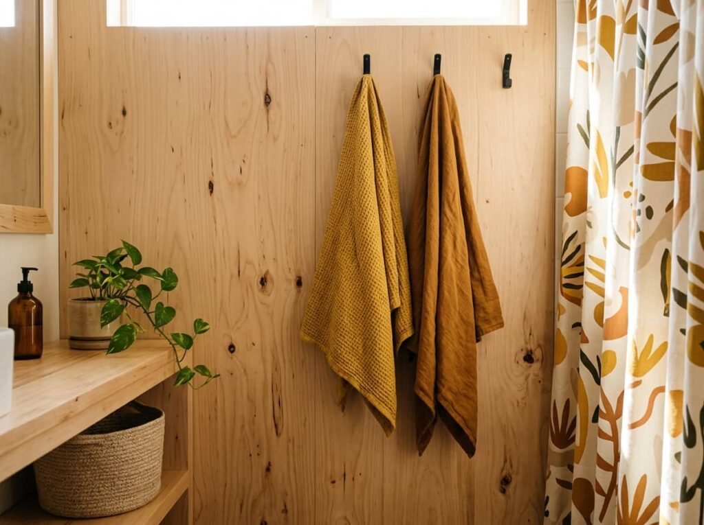
Keep this one simple: mustard and ochre work best as accents, never as the main wall color, next to pale birch.
Birch is light and a little cool, so it needs the warmth these colors bring, but too much mustard in a small room gets overwhelming fast. A painted vanity, a patterned shower curtain, or even just two hand towels in ochre tones can be enough. The birch stays the backdrop, the color does the talking.
12. Warm Taupe Walls With Rich Mahogany Accents
A lot of people pair dark mahogany with equally dark walls and end up with a bathroom that feels more like a cave than a cozy space. Taupe avoids that entirely.
It’s warm enough to feel related to mahogany’s reddish brown, but light enough to keep the room from closing in on itself. This combination tends to suit older homes or bathrooms with existing wood trim, since mahogany rarely looks accidental, it reads as a deliberate, slightly formal choice. Best kept to a single large piece, like a vanity or a framed mirror, rather than spread across multiple surfaces.
📌 Good To Know
Mahogany darkens over time as it’s exposed to light, so a piece that looks medium brown now may read noticeably deeper in a year or two.
Conclusion
The right bathroom color combinations don’t fight the wood you already have, they work with its undertone, whether that’s the gold in oak, the deep red in mahogany, or the grey in driftwood. Once you match the color family to the wood’s temperature, the rest of the room tends to fall into place without much extra effort.
You don’t need to overhaul everything at once. Most of these pairings can start small, a painted wall, a new vanity, a couple of accent pieces, and build from there as you see how the colors actually live with your light and your space. Pick the one that matches wood you already own, test it before committing to a full room, and let it sit for a few days before deciding.
Leave a Reply